Hi! I'm Taryn, a writer, designer and soon-to-be-bride from Atlanta, Georgia. Sit a spell with me and catch up as I plan the wedding of my beer-loving, confetti-throwing dreams to the wonderful Mr. Williford.
A Not-Fall Fall Wedding
Mr. Rooster and I kind of fell backwards into having a fall wedding. In my pre-engagement understanding of wedding planning, I knew that having your heart set on a specific date and a specific venue can end in heartbreak. Because having a cool space was most important to us, I never thought we’d find ourselves in the position to just pick our wedding date out of the blue. But we did. Since we started planning pretty early in what we wanted to be a long engagement, our chosen venue was wide open in their availability.
We decided on October because it’s typically the dryest month in Atlanta (and the brewery is partially outdoors). And we picked the 11th because it’s right on the cusp of when it starts to get chilly (10-11 is just a cool date). It’s also Rooster’s best man’s anniversary, coincidentally, but he and his wife gave us their blessing before we signed any contracts (bridal ettiquette and all).
But here’s the thing, y’all: I’m so not “Miss Pumpkin Spice,” and I really don’t like fall colors. If I were ever chosen as a pinup in a calendar, I’d be winter, or maybe even summer. But definitely not fall. So our fall wedding isn’t going to be a fall wedding at all. When developing a style and color palette, I kept going back to bold neutrals with pops of bright color.
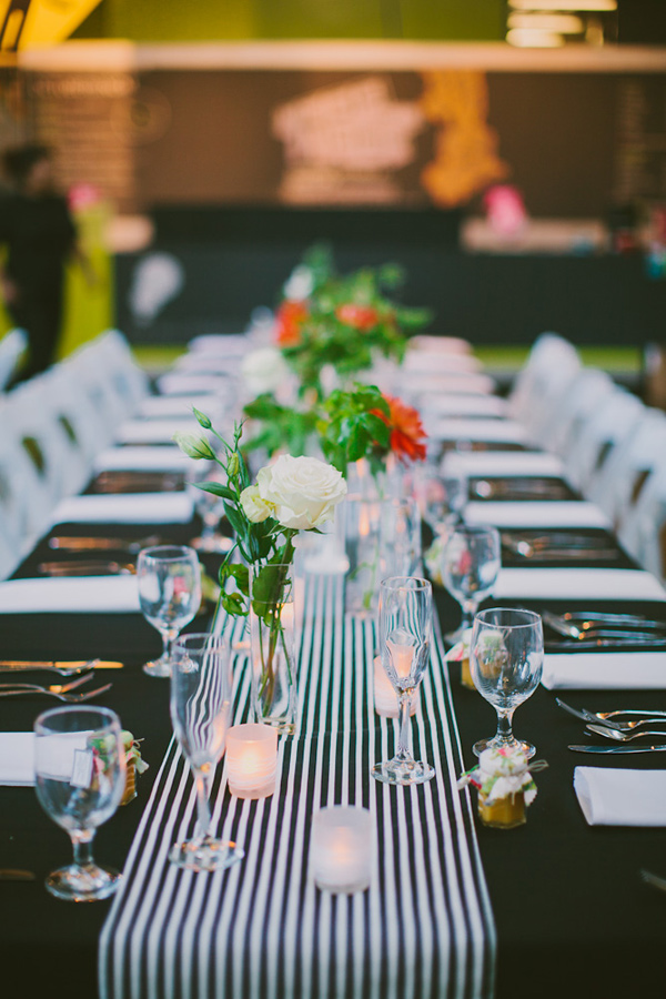
Jackie Wonders via Ruffled
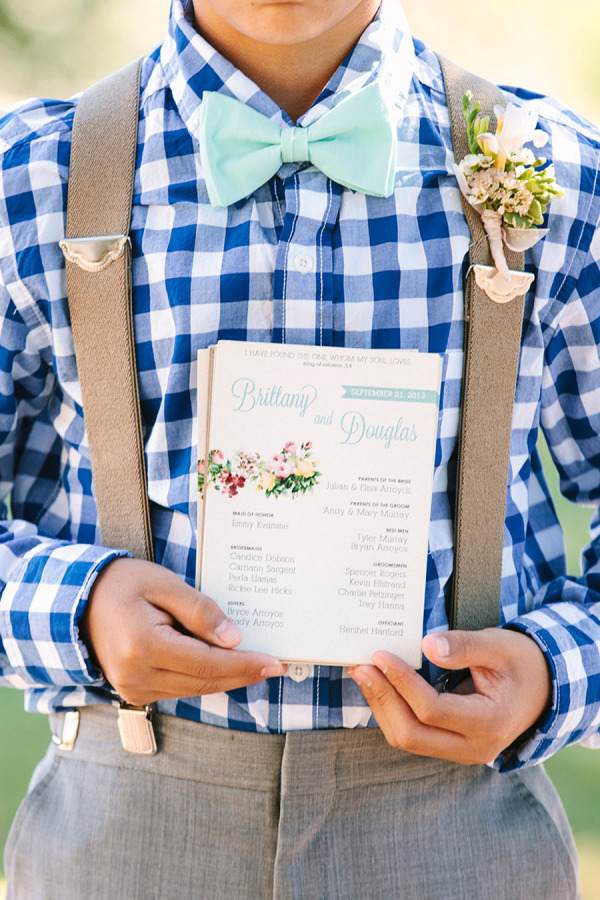
Photo Love
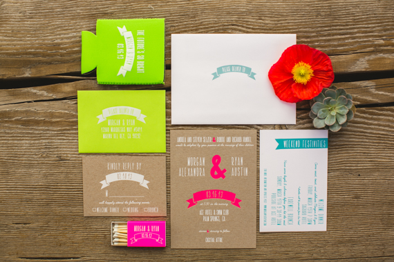
Invitation Suite by Bash, Please, shot by EP Love via 100 Layer Cake
But some colors that I liked in other wedding palettes just seemed wrong for a fall fete. I know it doesn’t matter, and that I can have a pastel and neon wedding if I want to, but the truth is that I do want to be at least a little apropos for the season. Not all “Next on TLC: David Tutera’s X-treme Fall Pumpkin Wedding,” but you know, not pastel either.
Throwing another wrench into my wedding style plan was our venue. I love our venue. It’s totally got the vibe I want. But there’s a lot going on inside and outside the space, color-wise, that I feel like our wedding needs to harmonize with. Bright red benches, yellow walls, lots of mismatched furniture in colors like emerald and teal and silver. I wanted to play off that palette, without imitating it. Easier said than done.
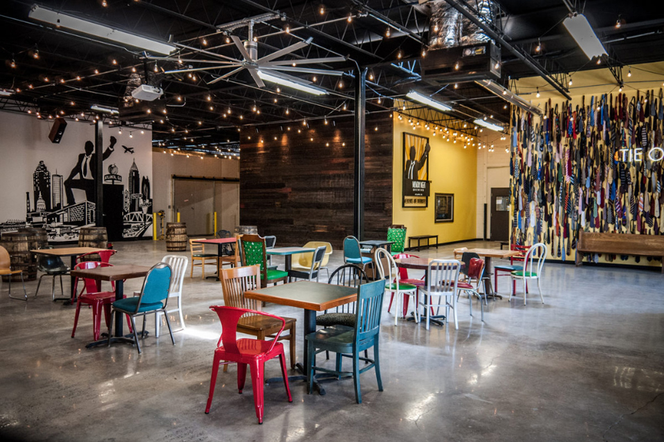 Monday Night Brewing
So I struggled with choosing a color palette for a long time. When people asked me “What are your colors?” (and they do, oh they do!), I never committed.
That strategy of total avoidance worked for a while, until I realized that we were quickly approaching the part of our timeline when I needed to send out Save-the-Dates. As a graphic designer, I wanted to be hands-on with our paper products and design everything from scratch. Bespoke and totally custom. But without a color palette or defined style plan for the day, I didn’t know where to start.
Here’s a little secret: Coming from a professional creative person, when you don’t know where to start on a project, it’s best to just start. Just do it. Wake up one morning and decide to get your hands wet and begin. So I did. I started designing our Save the Dates without knowing what I wanted it to look like or what colors or patterns I should use.
And you know what? It worked. It’s impossible for me to explain my process, but when I allowed myself time to just sit down and play with different visual elements (including lots of photos of our venue and some weddings I liked), I found something that worked. It was bold, modern and true to fall, in its own way.
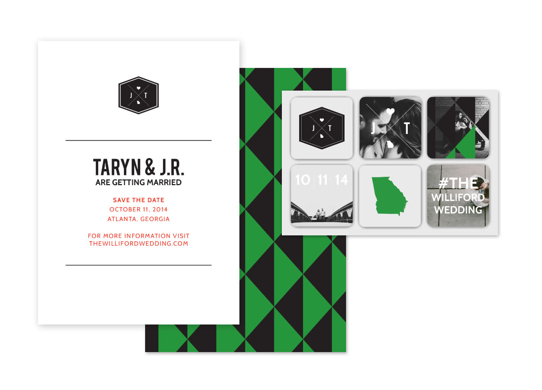
I’ll write more about our Save-the-Dates (and those stickers I’m so excited about!) in another post once we’ve got them all polished up and sent out. For now, I’m just happy to have made some progress toward deciding on a wedding style that’s true to season, fits our venue and is totally our style.