Hi! I'm Taryn, a writer, designer and soon-to-be-bride from Atlanta, Georgia. Sit a spell with me and catch up as I plan the wedding of my beer-loving, confetti-throwing dreams to the wonderful Mr. Williford.
Our Wedding’s Color Story
As a designer, I like to think I have a pretty good eye for color and composition. But as a self-professed perfectionist, I have serious trouble making big decisions. I need to know that everything is going to work perfectly together (and perfectly with our brewery venue and fall season) before nailing down so much as a single shade of our wedding colors.
So Rooster and I remained blissfully in the dark about wedding style for the first several months of our engagement until eventually, our save-the-dates would force me to decide. We were nearing the 8-month mark and I knew we’d want to get information about our wedding weekend to our out-of-town guests as soon as possible. I also knew I wanted the save-the-date to coordinate with our wedding style as a whole. So it was kind of important that we knew what that wedding style would be, right?
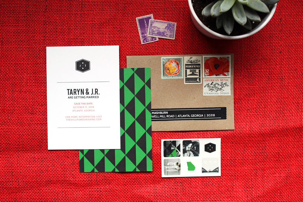
Well, sorta. I ended up totally designing our save-the-date cards before deciding anything at all about flowers or bridesmaid dresses or the color of tablecloths. For the cards, I just went with what seemed right for our venue and season. After our save-the-dates were done, I was able to zoom out and conceptualize our whole wedding theme. So in a way, our save-the-dates are inspiring our wedding style instead of the other way around.
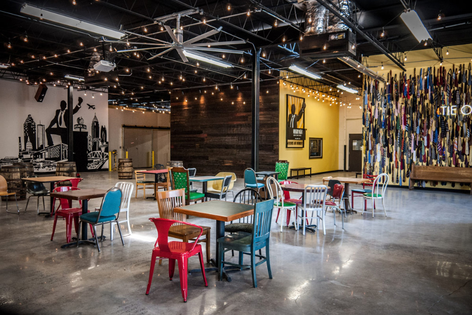
So with our save-the-date in one hand and a photo of our venue in another, I laid down a robust color palette to guide our wedding decisions for decor, florals and attire. We might use all of these colors, or maybe none of them. But I love how they feel together and they’ll help guide us to make choices in some of the important wedding decisions coming up quickly.
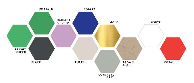
Our “Wedding Colors”
I don’t exactly love the concept of wedding colors. I mean, I love seeing themed weddings and adore how everything comes together when you have a color vision for a party. But I think brides (myself included) get so wrapped up in “wedding colors” that they feel like ev.ery.thing. needs to be one of those two or three hues. I don’t want to get trapped by these dominant colors, but here are the shades we’ve chosen to guide our wedding’s color story:
- Emerald Green & Bright Green: Green is the dominant color in our paper, and will probably be a dominant color in the rest of the wedding, too. It’s already repeated in some of the chairs at the brewery and the greenery around the brewery patio, plus I’m sure it will show up again in the greens in our florals. I’m using these two (really similar) shades here to represent a single “hue,” knowing that we’ll likely have different shades of green represented in our bash.
- Radiant Orchid: It’s Pantone’s color of 2014 and dammit it’s trendy. SUE ME. I also love how easy this will be to work into our florals. I mean, it’s named after a flower.
- Cobalt: This shade of blue is one of my favorite colors ever, and I love the way it looks with white, black and gold.
Our Neutrals:
To get a cohesive look with anything from rooms to outfits to events, it helps to balance all the brights with a set palette of coordinating neutrals.
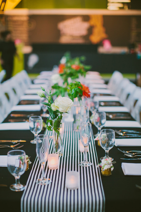
- Black and White: The guys will be in black suits with white shirts. I love black and white stripes and expect to use that pattern on the tables for sure. We’ll definitely use a fair share of this bold color combo wherever we can.
- Brown Kraft: We used brown kraft paper envelopes to send our save-the-dates, and the brown paper texture will surely make another appearance in our invites and in the paper on the day of the wedding.
- Gold: Introducing a metallic neutral is fun way to liven up a palette, and this warm shade of gold is ours. I’m loving gold accents, and loving how they look with our main wedding colors.
- Putty & Concrete Gray: Roo and I have the same favorite color, and it’s gray. Of course we’re going to add this in where we can. Putty gray is actually really close to the color of my dress, and I’ll work in a cooler concrete gray (maybe even some actual concrete) in some of the decor on the tables.
A Pop of Color:
This is my favorite bit of advice for architecting a color palette for events or anything else: Choose one color that’s very different from your palette, and use it very sparingly in tiny, tiny doses.
- Coral: All our colors are cool and a little earthy, so I wanted a pop of something warm and bright. There’s lots of bright red details at the brewery that will pop against our palette, so I plan to use reddish-coral with a light hand around our event (like that bit of the text on our save-the-date that’s coral—I’m not kidding about the super small doses thing).
Jackie Wonders via Ruffled
See? A teeny hint of coral to make the green and black pop.
I know I think about this stuff way more than I need to, but I’m really pleased with the palette. And while we haven’t made many style decisions yet, I think it will be really easy to do with this color map in mind.