Hi! I'm Taryn, a writer, designer and soon-to-be-bride from Atlanta, Georgia. Sit a spell with me and catch up as I plan the wedding of my beer-loving, confetti-throwing dreams to the wonderful Mr. Williford.
The Many Ways to Address Your Own Envelopes
When it comes to lettering and illustration, I like the eccentric. I love anything that looks messy and spontaneous. Like it was brushed on in a hurry and just looks perfectly imperfect.
 Stephanie Fishwick
100 Layer Cake
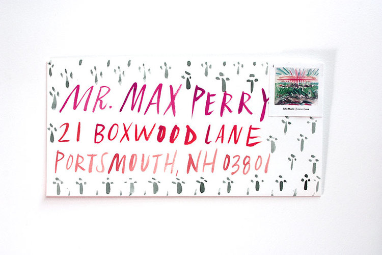
It looks so easy and effortless, so I knew this was something I could try to tackle on my own. Who needs a $3-per-envelope calligrapher, right? Certainly not me, Little Miss Do-it-Yourself. I wanted to try and replicate that style myself when I addressed Save-the-Date envelopes.
I had just begun to do research on the best materials and media for hand-lettering envelopes when I stumbled upon the post that would guide my whole DIY lettering experience: Eccentric Envelopes for The Non-Calligrapher by professional letterer and illustrator Stephanie Fishwick. She made it feel really do-able, sharing inspiration and advice on what to use, plus littering the post with little motivational pep talks that will have you thinking you can conquer anything. “Your own handwriting has a voice and a style. Go with it!”
So I did. I went with it. I tried several different suggestions for hand-lettering from Stephanie’s post, plus a few other ideas I thought might look nice, and now I’m here to report back.
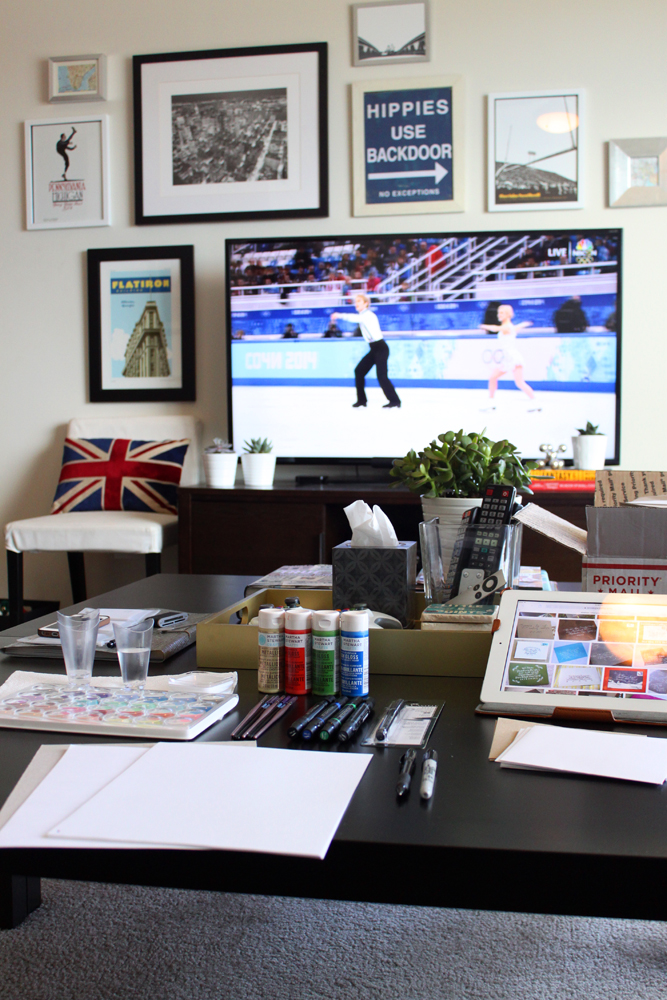
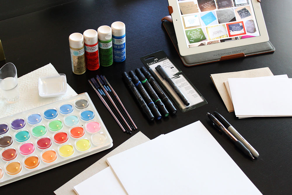
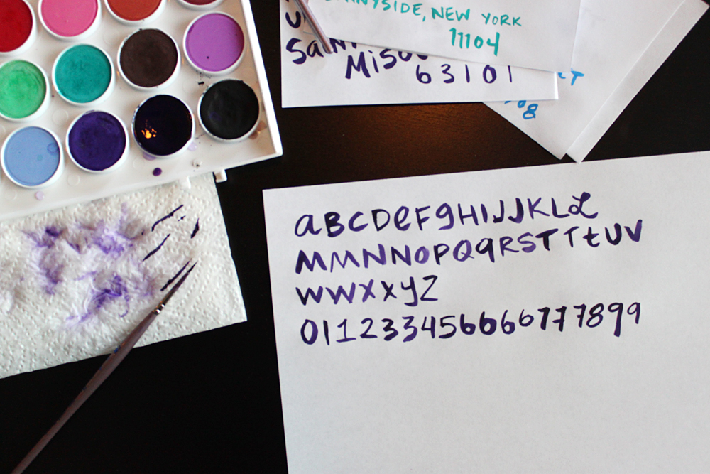
After a quick trip to Michaels, I set up shop in my living room, turned on the Olympics and got to work. In addition to the different lettering media, I also kept lots of plain computer paper around. Cut into fourths, a standard piece of paper was just about the size of my Save-the-Date envelopes, so I could gauge how the different marks from different media would fit.
First up: The Materials.
- Watercolor paint; the cheap stuff is totally fine
- Acrylic craft paint
- Synthetic (“acrylic”) brushes, various sizes (all round)
- Natural watercolor brushes, various sizes (all round)
- A Faber-Castell artist brush pen
- Prismacolor brush markers
- A regular old ballpoint pen
Before I get into how the different materials looked and acted, I want to share the method for my initial trials. Since the style of lettering I was going for was supposed to feel natural and effortless, I just used my (admittedly messy) natural handwriting when testing out the different media. Using my natural (messy) penmanship also gave me a great perspective on how easy or difficult each medium was to work with. If one of these paints or inks looked good with my natural handwriting, it would be easy to replicate the look on envelope after envelope.
So I just opened everything up, got my brushes wet and went to town. Below, the results, along with my feedback on each medium.
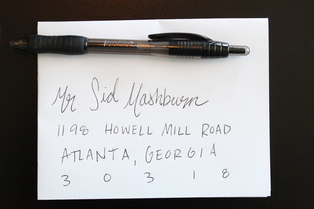
Ballpoint Pen
- Control group.
- Very meh.
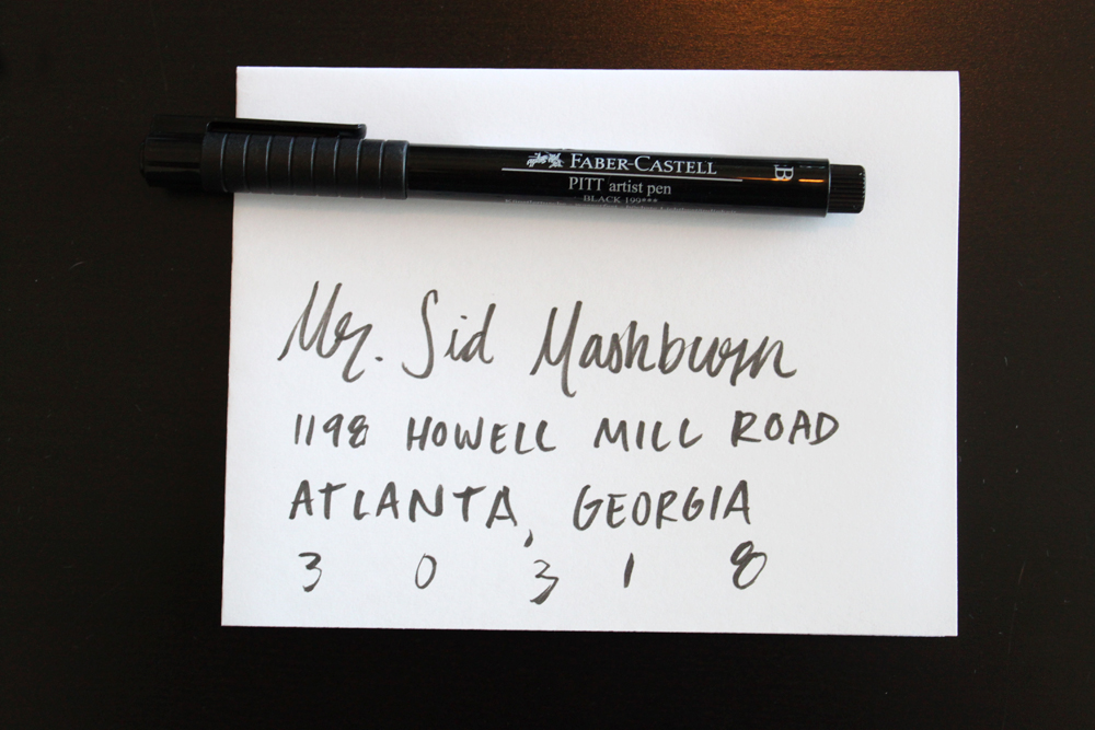
Brush Pen
- An instant improvement over ballpoint pen, but not a lot of character.
- Really easy to use and foolproof.
- If you’re going to address invites with a plain pen, a brush pen gives you a better look with no effort.
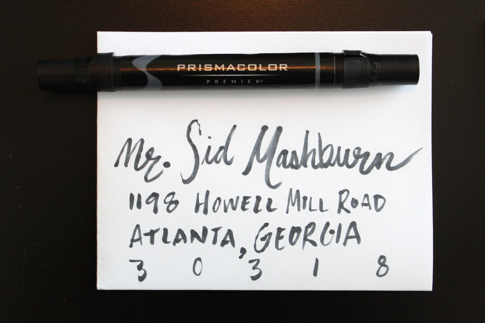
Brush Marker
- Way more character than the brush pen. Almost looks like actual paint.
- Difficult to control at times, and inconsistent in its application.
- With practice on consistency, this could be a great result with lots of eccentricities.
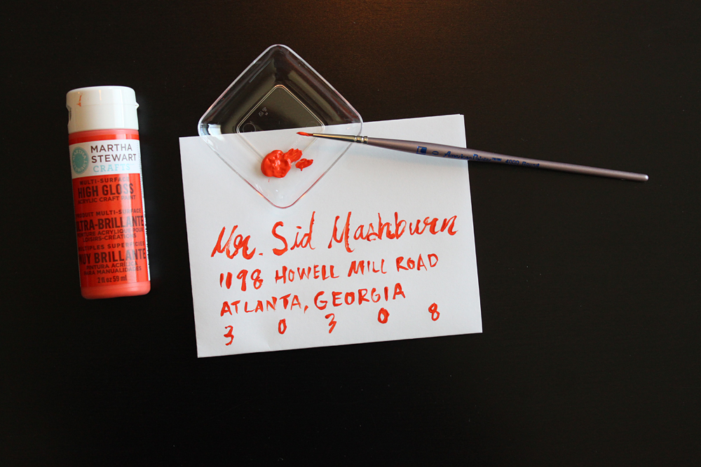
Acrylic Paint
- Really difficult to use.
- Messy result.
- Just don’t.
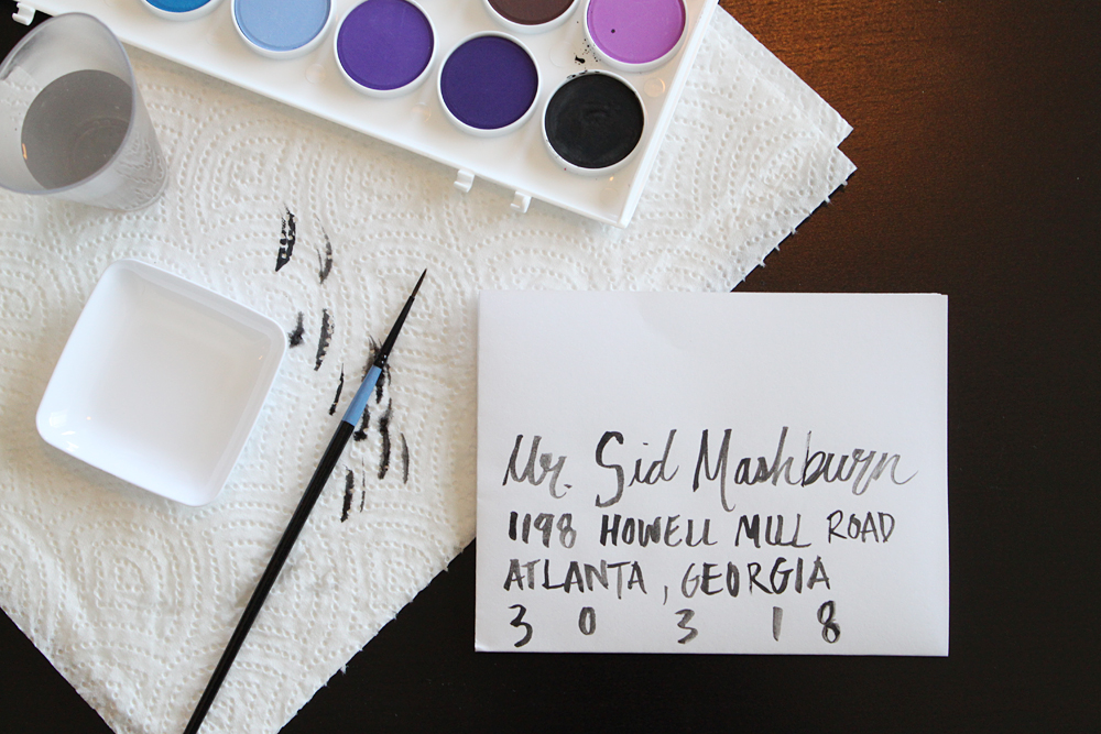
Watercolor (with a natural bristle watercolor brush)
- Lots of character. I love the variety in the ink; it’s translucent in places and very unique.
- Easier to control than the brush marker with the same eccentricities.
- Prone to mistakes; the watercolor brush is designed to hold water, so it drips and splatters a lot.
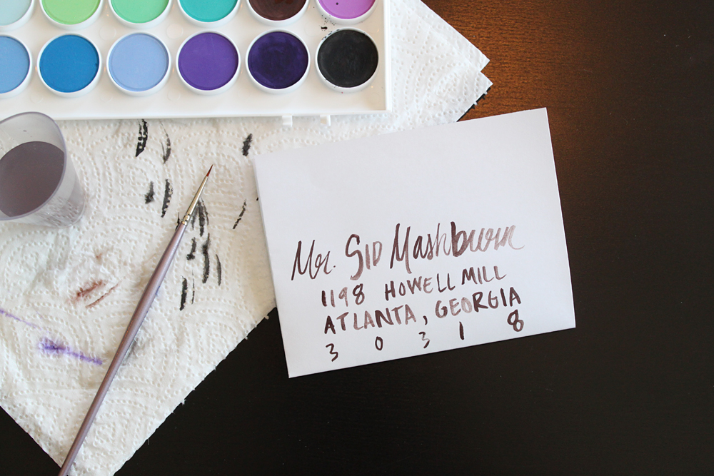
Watercolor (with a synthetic acrylic brush)
- A very similar result to the same paints with the watercolor brush; a lot of the same character and personality.
- On first pass, the synthetic brush is easier to control and manage than the natural brush. I’m able to control the line better. Plus less likely to drip and splatter (though it still happens if you’re not careful).
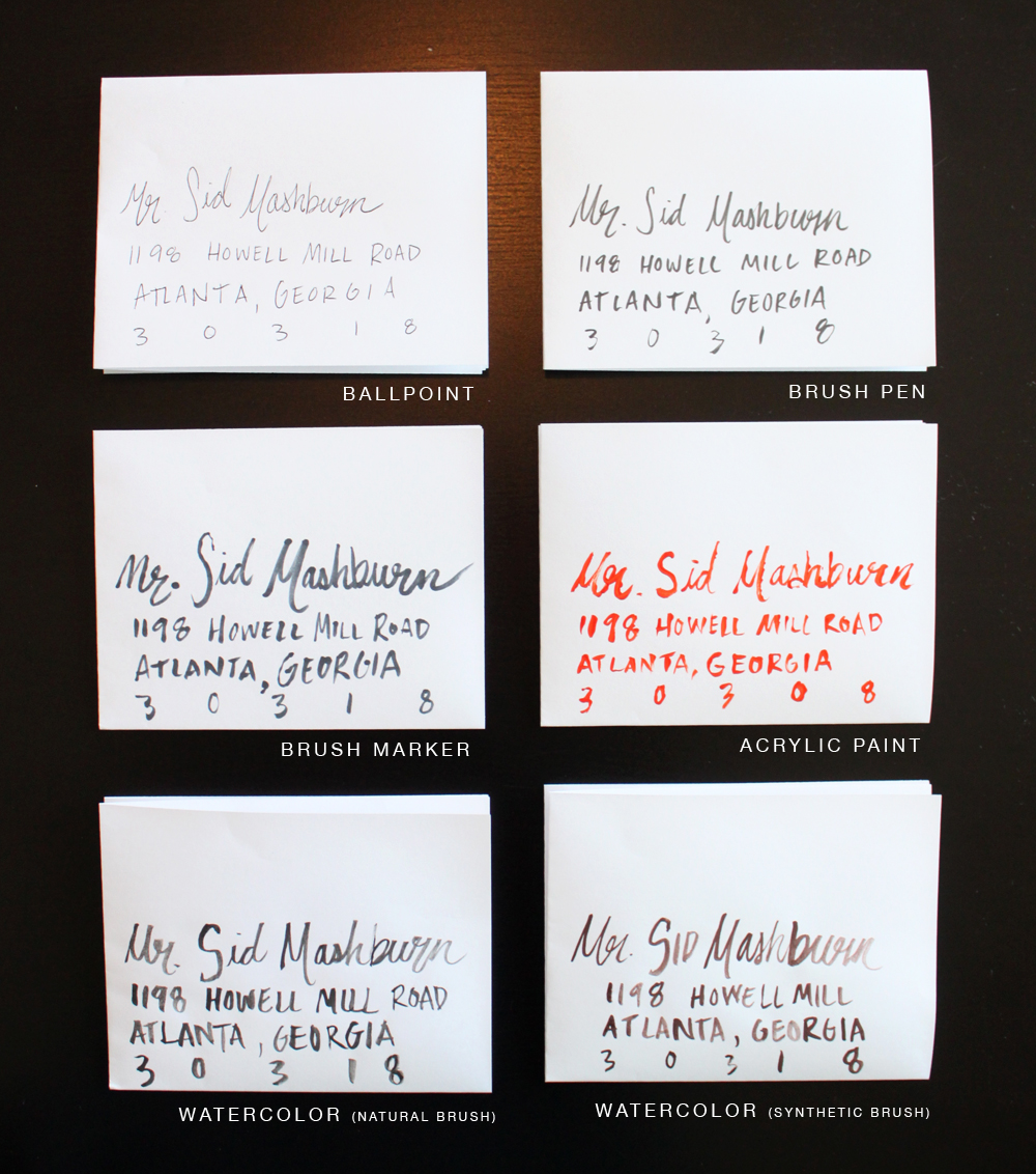
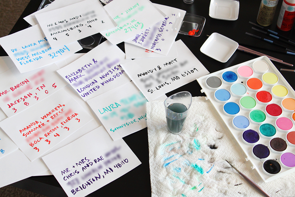
The synthetic watercolor option was definitely my favorite after trying them all out, but here’s a cheat sheet to see all the results next to each other. I think the ease of use comes through the photo, too. That acrylic paint was a pain, and you can tell.
So I liked the last technique, but I wasn’t in love with my first go at it. I decided to practice. And practice. And practice. I developed an alphabet and addressed many fake envelopes with our real guests’ addresses (hence the blurring) to get a feel for how do-able the whole project would be. Would I get sloppy after 20? Only one way to find out. Paint, paint, paint.
I was getting better, but still not loving the result. I decided to practice more, this time on kraft paper, like our envelopes were made out of. I even took some of my best efforts and lined them up next to the Save-the-Date suite I designed to get a feel for how the whole package would look together.
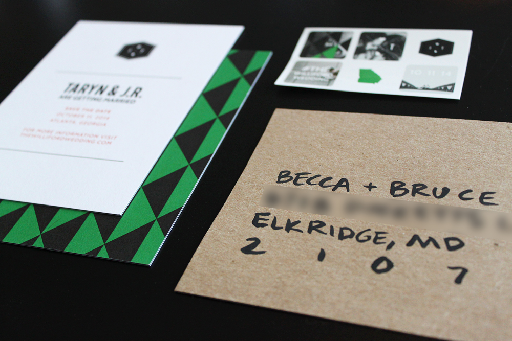
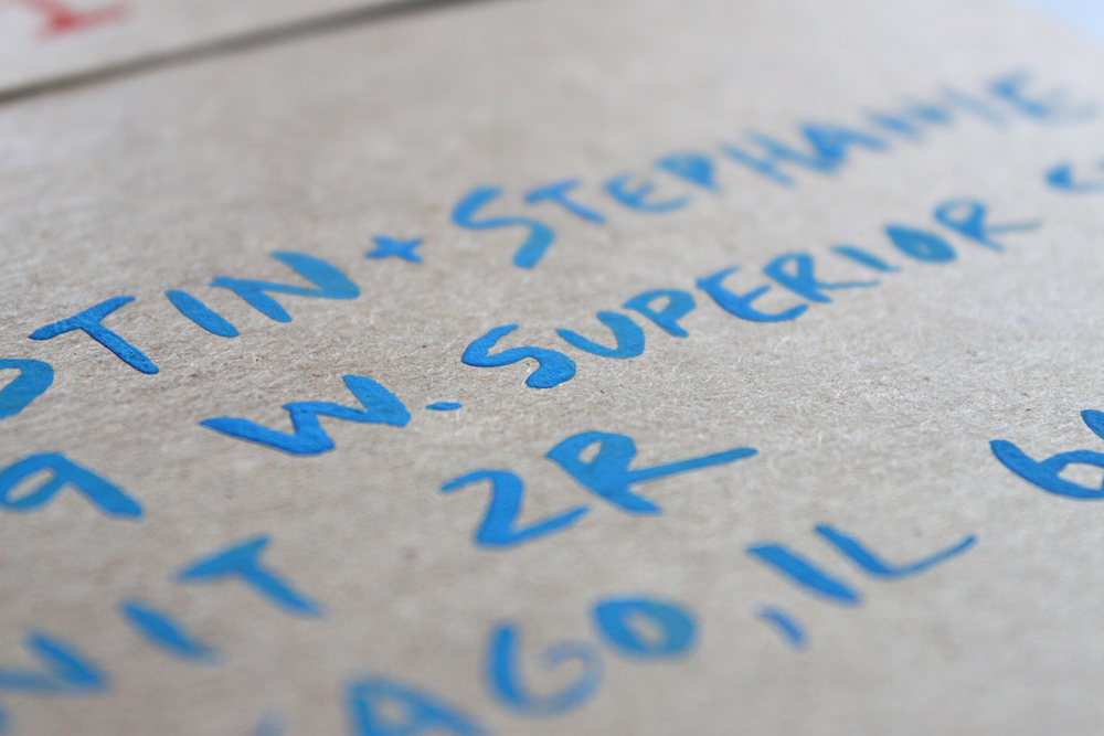
The result was actually very intriguing. I think the water didn’t really soak into the kraft paper like it did the plain paper, so the paint just kind of stayed on top and took on a really cool and unique chalky texture. My goal, however, wasn’t great texture (that would be a bonus). I still wanted the result to look like my original eccentric lettering inspiration.
Did my watercolor lettering capture the feel I wanted? I’m not sure. I think it still looks lazy-messy, instead of whimsical-messy. Maybe I need more practice. Or maybe I need to find another option. Any ideas?