Hi! I'm Taryn, a writer, designer and soon-to-be-bride from Atlanta, Georgia. Sit a spell with me and catch up as I plan the wedding of my beer-loving, confetti-throwing dreams to the wonderful Mr. Williford.
Save the Date: Return to Sender
Mr. Rooster and I used Postable to collect addresses from our friends and family, and it was such an effortless process. We send out a link, and our guests input their own details. It’s easy. It’s also a great way to shift the blame in the event that any of the addresses have mistakes and don’t get to their intended recipients. Heh heh.
Hopefully we have it all right. But just in case, Roo and I needed a way to mark down the return address on our Save-the-Dates so any misdirected mail could make its way back home. Did we simply take a ballpoint pen and use our years of grade school alphabet training to write the letters and numbers on the back of the envelope? No way! That’s for plebeians! And for people who don’t overthink stupid things and make more work for themselves! Not me, clearly.
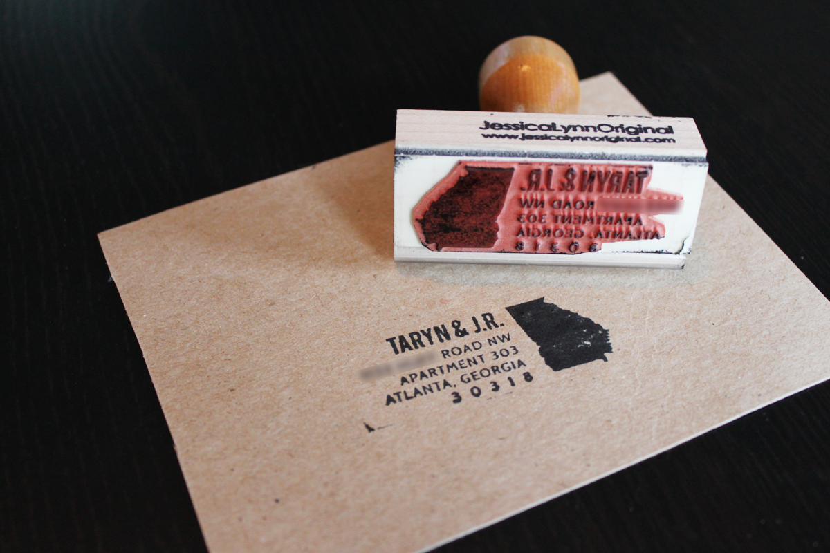
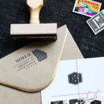
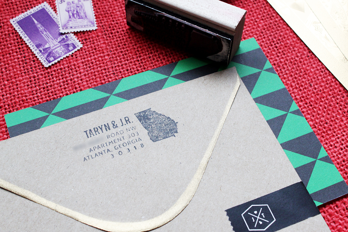
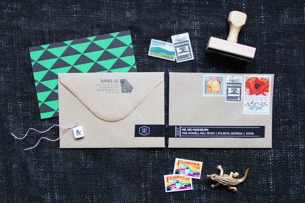
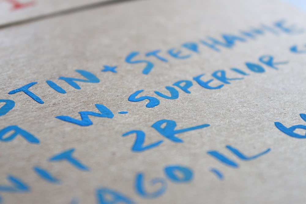
So we ordered a rubber stamp with our address on it. I designed the art in Adobe Illustrator with some of the elements from our wedding logo, then sent it off to Jessica Lynn Original, who I found on Etsy. For $25, we had a cute graphic that we could stamp on the back of our kraft paper envelopes over and over again.
Was it the best idea ever? Not really. Our design used some fairly thin lines close together, so you needed really good stamp technique to get a perfect print. The very first stamp imprint above looked great, and so did the test envelope I stamped right after it.
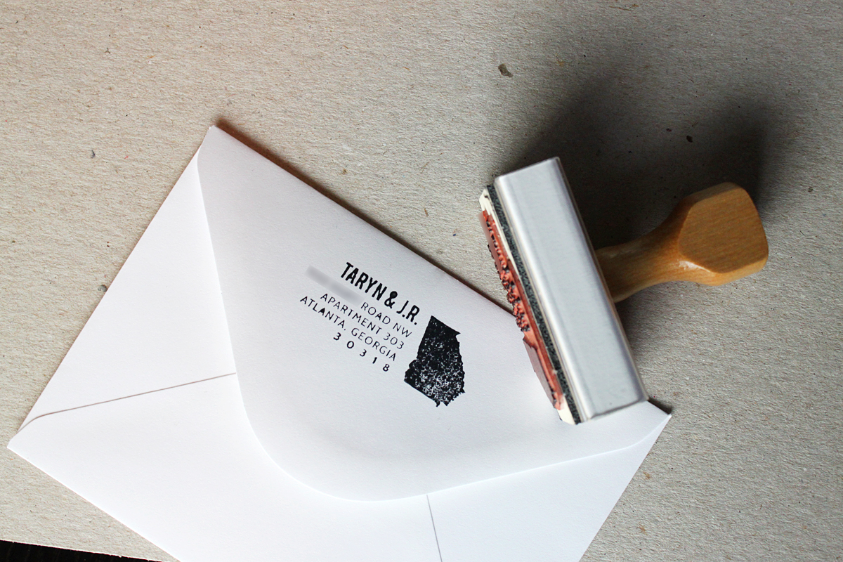
But dress rehearsals always go better than the first show. After I got through stamping the first 15 or 20 envelopes, the ink started getting drippy and gunky. I should have taken a photo of some of the bad ink attempts, but I was just really disappointed. And a little worried that they’d be illegible, which kind of defeats the purpose of a return address.

But I carried on, and my stamping technique got better. You eventually get a feel for how much ink to apply to the stamp, and how much pressure to press down with. Oh, and you learn to stamp the envelopes while they’re still empty. That was one of my big mistakes. It’s difficult to get an even stamp on an envelope with a twine-wrapped card inside. Oops.
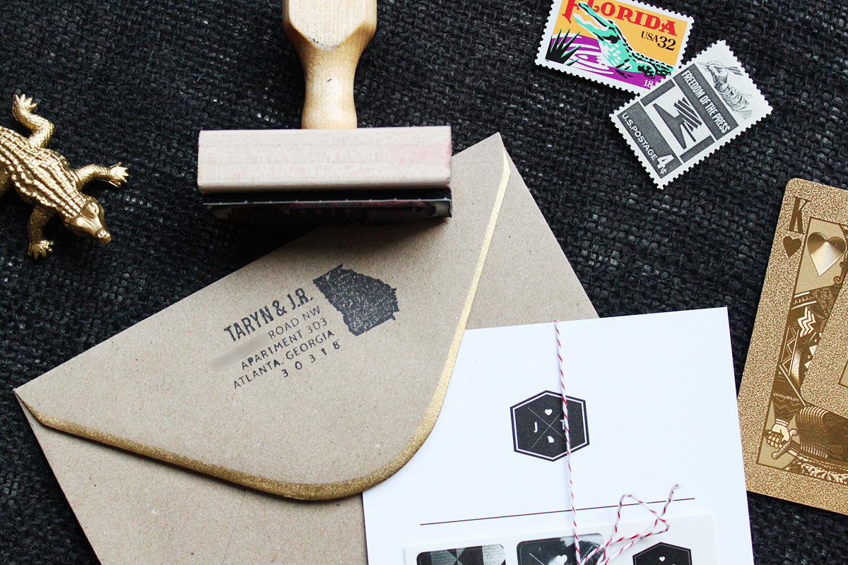
Overall, I’m happy with the result. Was it easier than writing our names? No. Does it have more style for a little more effort and expense? Yes. It wasn’t the most practical decision, but it does make me really happy to see that little stamped detail on our Save-the-Dates. Well, some of them at least.
How do you handle (semi) botched projects?
Ten Desserts Are Better Than One
Who’s up for a cake break? I want to take a little hiatus from sharing all the Save-the-Date details to talk about our plan for desserts. I can’t share too many planning details because, well… there hasn’t been any planning going on, since we’re not doing the traditional wedding cake thing.
Not that we don’t love sweets. I am an endless pit when it comes to dessert, and think no meal is complete without a sweet bite to finish it. My philosophy in life is basically the same as Buddy the Elf.
I Screen You Screen via Etsy
Mr. Rooster likes sweets, too, but he’s much more particular than I am. He loves ice cream and apple pie, but he isn’t a huge fan of cake. Roo also thinks frosting is the worst part of cake. What kind of monster am I marrying?
The Bleu Squid Bakery in Mystic, Conn., viaThe Distracted Wanderer
I could skip the cake, to be honest.
So on one hand you have a bride who likes cake but also likes a billion other sweets and thinks choosing a favorite dessert is like choosing a favorite child. On the other hand, there’s a groom who kinda hates cake. So why would we have a cake at our wedding?
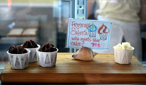
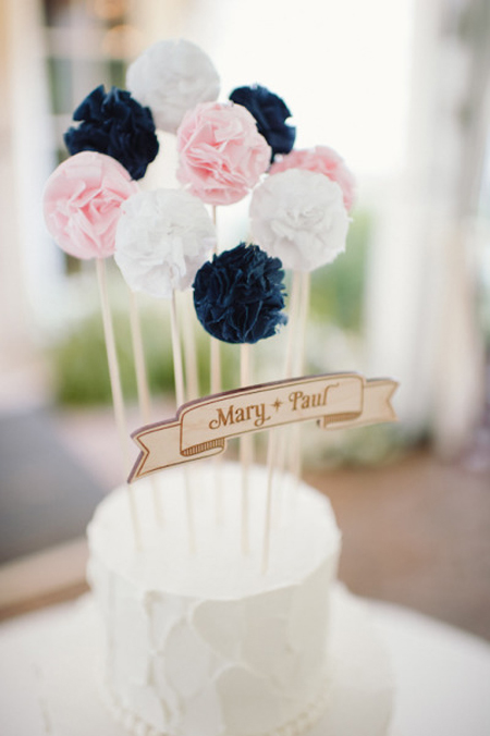
Instead, we’re opting to have many different desserts. Cake will be part of it, I’m sure. But it will likely be a small cake; one tier, not three. Like what you’d serve at a birthday, but a heck of a lot more sophisticated. With a cute cake topper, obviously. I wouldn’t miss any chance for some extra whimsy.
Cake by Sugaree, Toppers by Potter & Butler, shot by Paper Antler via Style Me Pretty
A cake topper…. or ten.
Our small, sophisticated cake will possibly be a Publix grocery cake, if I get my way. I know many of you won’t understand, but can I get an “Amen!” from my fellow Floridians? Is it the chic choice? Not a chance. But cake from the local Publix bakery is like heaven on earth, with all that pillowy sweet frosting. I grew up eating Publix cake at every birthday and baby shower, and I couldn’t imagine serving cake at my wedding from anywhere else.
Publix
Publix cake. Second only to Publix subs.
In addition to the possibly-Publix cake, we want to serve a few other desserts. We’ve thrown out some ideas—like pie, brownies and macarons—but haven’t nailed anything down yet. I see “order the cake” staring me down on my wedding checklist, so I know we need to get to work soon. Until then, here’s what I know:
- Everything will come from one place. We have a coordinator and many helpful friends, but I don’t want anybody (including me) spending the day of our wedding shuttling to three or four different bakeries or confectioneries to stock our dessert bar. I would love for everything to come from one place so we can make one trip, or possibly meet a minimum for delivery. The exceptions to this are anything that can be bought/made/delivered ahead of time (like Candy), and that damn Publix cake.
- We’re planning for ten bites per person. We’ll have 90 people at the wedding, but that doesn’t mean we need 90 cupcakes and 90 macarons. We’re going to plan on everyone having 10 bites of dessert, so we need to stock about 900 bites total. I got the suggestion from this post on A Practical Wedding about self-catering a dessert reception, and while it sounds daunting, it’s really a good benchmark. A mini cupcake might be 1 bite, while a regular cupcake is 4. A slice of pie is probably a full 10 bites, so one pie could take care of 80 bites at once.
- I am going to need a lot of stuff. I own five cake stands. That’s probably more than the average gal, but not nearly enough to set up a dessert bar. Everything else will need to be either bought, borrowed or rented. I’m keeping an eye out for cheap serving pieces when I’m out and about, but in the end I’ll probably rent some extra pieces from our wedding coordinator or the event rental company who’s stocking our tables and chairs. Thankfully, “mismatched” is proving to be somewhat of a theme for our wedding, so everything will look right at home no matter where it came from.
There’s a lot more to do and decide on the dessert front, and I’m sure I’ll have another update down the road once we decide on all the goods. Until then, I’ll take suggestions on what to serve. So… what’s your favorite dessert?
Save the Date: …with Stickers! And labels!

Our actual Save-the-Date card doesn’t use any of the wonderful photos our photographer took of us, and we like it that way. But I wanted to find some way to use the photos, plus add a little practicality to the idea of “saving the date.” That is the idea, isn’t it? Your guests should actually take your save-the-date announcements and mark their calendars, right?
I don’t know whether the general opinion is to love or loathe magnet save-the-dates, but you can’t deny that they’re so damn useful for remembering to pencil in a friend’s wedding date. I wanted to include something memorable and practical with our save-the-dates, but didn’t want to follow the herd. Enter Moo StickerBooks.

While I was looking at Moo’s printing options, I wandered over to their other accessories and had an epiphany when I saw their sticker books. I could order a book full of tiny sheets of stickers around 1-inch square, and include one sheet of six stickers with our save-the-dates so our guests can literally mark their calendar.
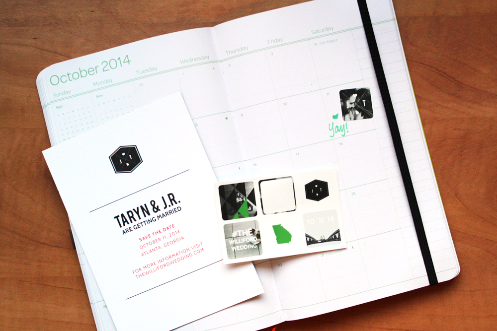
It was an easy extra project that turns our save-the-dates into something special. I love that we found a way to incorporate our engagement photos, and I think our guests will like the convenience of penciling in the day of our wedding with a sticker.
The stickers will get wrapped up with our Save-the-Date cards, put into our gold-edged kraft paper envelopes, then slapped with a wraparound address label.
After my adventure in watercolors, I decided to scrap hand-lettering and try out the next best thing. I know not everyone is going to agree with my assertion that wraparound labels are the next best thing to custom hand-lettering, but after trials and tribulations with budgeting for a calligrapher (never gonna happen) and trying to paint addresses on envelopes for our Save the Dates, I decided wraparound labels were the ideal solution to get these things out of the house and on their way to our guests.
I really like the size, aspect and orientation of Minted’s Skinny Wrap return address labels. To me, the long and thin aspect appears more custom or bespoke than other thicker wraparounds. It just feels more deliberate (and not like “Plan C,” as it were). So I started with that concept when I sat down to design our labels.

Minted
I also spent a lot of time on Pinterest and Google Images searching for creative food packaging. How many times have you seen or been gifted with a cute jar of jam or pretty little candy bar? Companies and products who spend time thinking about their packaging (I’m looking at you, Apple) can be a huge source of inspiration as you create the vision for your stationery, or any other “package” such as welcome bags or wedding favors.
 Spicemode branding by Isabela Rodrigues, via Inspiration Hut
Tank Goodness branding by Steven Jockisch on Behance
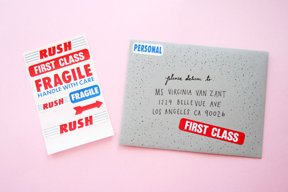
Lastly, I looked around at other postage-inspired design and vintage postage labels. I liked the idea of working in some classic postal imagery. The red-and-blue air mail stripes don’t really fit our theme, but there’s plenty of line work and layout from postal labels I could tie in to our envelopes.
 Paper Pastries on Etsy

Invitation Suite by Scotti Cline Designs
Inspired by all that I searched and saw, I started to sit down with Adobe Illustrator and plan out our wraparound labels. For me, it helped to first mock-up our envelopes, using tools to sketch out our kraft paper envelopes, postage stamps, gilded edge, as well as the mark from our return address stamp. With lots of inspiration and a detailed artboard, it didn’t take long to build a design I was happy with.

It’s a simple design. The guests’ address is printed on the front side of the label with a little bit of modern line design. Since we already have a rubber stamp for our return address, the back of the label features our wedding logo. The edges, rather than being square, are cut off with pinking shears to mimic some of the food labels I found in the inspiration phase.

The cost of the labels makes my wallet smile, too. I was able to print them at home on full-sheet label paper, which I bought from an office store for $15. Add in the cost of a pair of decorative pinking shears ($10) and the grand total is $25. Around $150 cheaper than most of the quotes I got from calligraphers.
We still might splurge on hand-lettered calligraphy for the actual invitations, but I’m really happy with the wraparound labels. I’m gearing up to share the full Save-the-Date suite soon, so you can see everything in action together.
Save the Date: DIY Gilded-Edge Envelopes

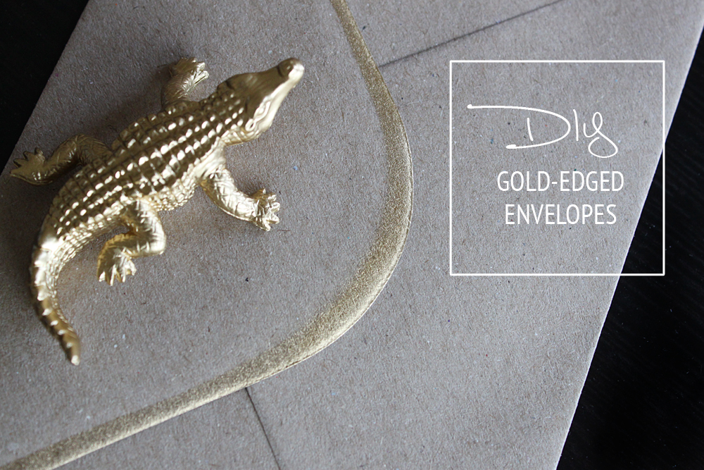
Out of everything associated with throwing a wedding, I’ve been the most excited about the paper. As a graphic designer, I keep looking for ways to inject a little of our personal style into the paper products involved in our wedding.
Most recently, I’ve been designing and putting together our Save-the-Dates. We decided to print them with Moo because we both loved the weight of Moo’s Luxe postcards, but we ended up with a weird size of card that fits a weird size of envelope …which we could only find from Moo. Stuck with their basic kraft envelopes, I looked for a way to add a little sparkle.
I was going after figurative sparkle, of course, but I quickly found some inspiration to add some literal shine to our boring envelopes. Amanda of 100 Layer Cake used gold spray paint to paint the edge of her wedding invitation envelopes, and it looked like just the thing to easily customize our Save-the-Dates!

100 Layer Cake
Amanda used other envelopes as a stencil for spray-painting a clean edge, but I don’t have many to spare, so I tried out a different technique. Here’s my tutorial on creating a foolproof stencil to give envelopes a modern gold edge.

Materials:
- Chip board; I got this pack of 25 sheets at Michaels for around $10
- Metallic Spray-Paint
- Uhhh… your envelopes?
- Really that’s it.

To make the stencil/guide:
1. Unfold the flap of one of your envelopes and use a pencil to trace around it in the center of one of your sheets of chip board.
2. Draw a line on each side of the outline to mark where the fold of the envelope sits.
3. Using an envelope, trace a new line for the flap just inside the one from the original outline. Mine is about ¼ inch away; this gap will determine the size of your edging.
4. Uncle Joey, it’s time to CUT. IT. OUT. Cut along the second flap line you marked in step three, then cut along the fold line to the edge of the chip board. Leaving the chipboard below the fold line intact means you can cover the entire part of the envelope you don’t want to spray.
You can stop at step four and get right to spraying, if you want. But I recommend making a lot of stencils. So…
5. Trace your stencil onto other sheets of chipboard to make multiple stencils. I had 50 envelopes to spray, so we made 5 stencils to spray them. It gives you flexibility to spray several envelopes at once, plus keeps you from using the same gunky stencil after a dozen or so sprays.
6. Cut ’em out! Marvel at your unmatched craftiness!
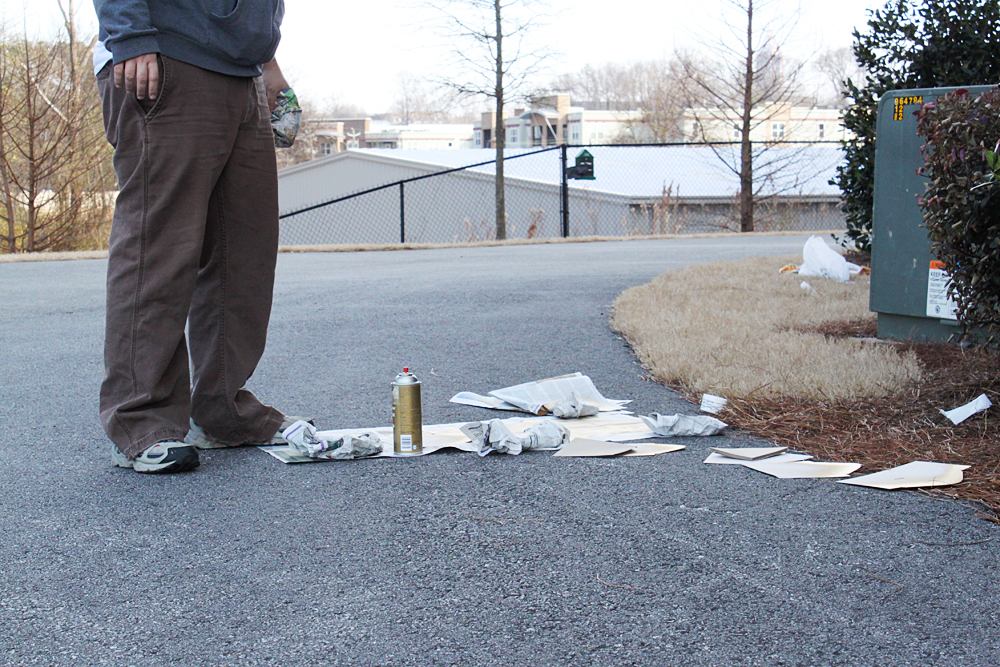
With your stencils in-hand, you’re ready to head out to a well ventilated space and get spraying. From here, it’s pretty easy to see what happens next:
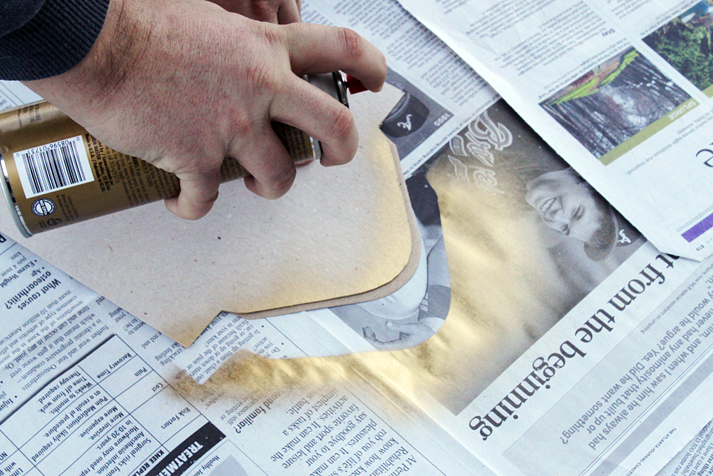

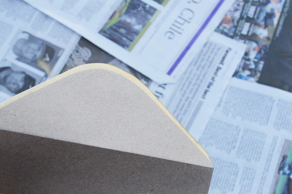
Place your stencil on top of an envelope, leaving just the edge peeking out, then give the edge a good pass with your spray paint from around 6 inches away. Once you lift your stencil, you should have a finished envelope below.
It does need just a moment to dry (especially if you have a heavy hand with the spray paint), but it will be ready to pile and stack in 30 seconds.

Boom! Beautiful envelopes.
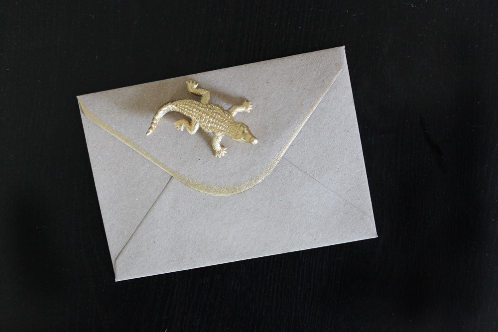
It looked really great with our Save-the-Dates, too.

It really is as easy as it sounds, and I would recommend this project to anyone looking to add some literal or figurative sparkle to their envelopes.
The Many Ways to Address Your Own Envelopes
When it comes to lettering and illustration, I like the eccentric. I love anything that looks messy and spontaneous. Like it was brushed on in a hurry and just looks perfectly imperfect.
 Stephanie Fishwick
100 Layer Cake
It looks so easy and effortless, so I knew this was something I could try to tackle on my own. Who needs a $3-per-envelope calligrapher, right? Certainly not me, Little Miss Do-it-Yourself. I wanted to try and replicate that style myself when I addressed Save-the-Date envelopes.
I had just begun to do research on the best materials and media for hand-lettering envelopes when I stumbled upon the post that would guide my whole DIY lettering experience: Eccentric Envelopes for The Non-Calligrapher by professional letterer and illustrator Stephanie Fishwick. She made it feel really do-able, sharing inspiration and advice on what to use, plus littering the post with little motivational pep talks that will have you thinking you can conquer anything. “Your own handwriting has a voice and a style. Go with it!”
So I did. I went with it. I tried several different suggestions for hand-lettering from Stephanie’s post, plus a few other ideas I thought might look nice, and now I’m here to report back.
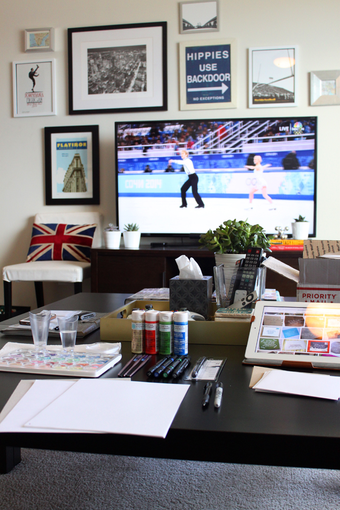
After a quick trip to Michaels, I set up shop in my living room, turned on the Olympics and got to work. In addition to the different lettering media, I also kept lots of plain computer paper around. Cut into fourths, a standard piece of paper was just about the size of my Save-the-Date envelopes, so I could gauge how the different marks from different media would fit.
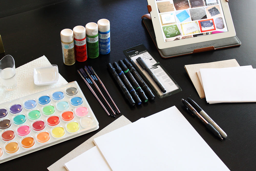
First up: The Materials.
- Watercolor paint; the cheap stuff is totally fine
- Acrylic craft paint
- Synthetic (“acrylic”) brushes, various sizes (all round)
- Natural watercolor brushes, various sizes (all round)
- A Faber-Castell artist brush pen
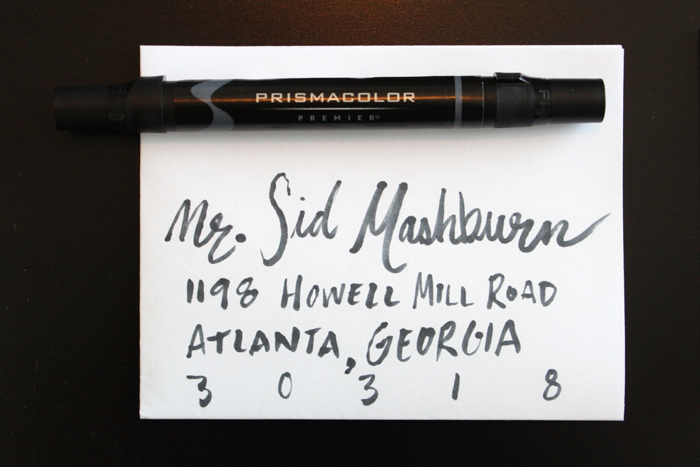
- Prismacolor brush markers
- A regular old ballpoint pen
Before I get into how the different materials looked and acted, I want to share the method for my initial trials. Since the style of lettering I was going for was supposed to feel natural and effortless, I just used my (admittedly messy) natural handwriting when testing out the different media. Using my natural (messy) penmanship also gave me a great perspective on how easy or difficult each medium was to work with. If one of these paints or inks looked good with my natural handwriting, it would be easy to replicate the look on envelope after envelope.
So I just opened everything up, got my brushes wet and went to town. Below, the results, along with my feedback on each medium.
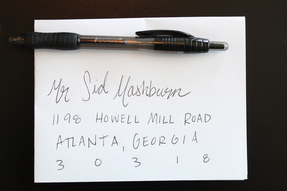
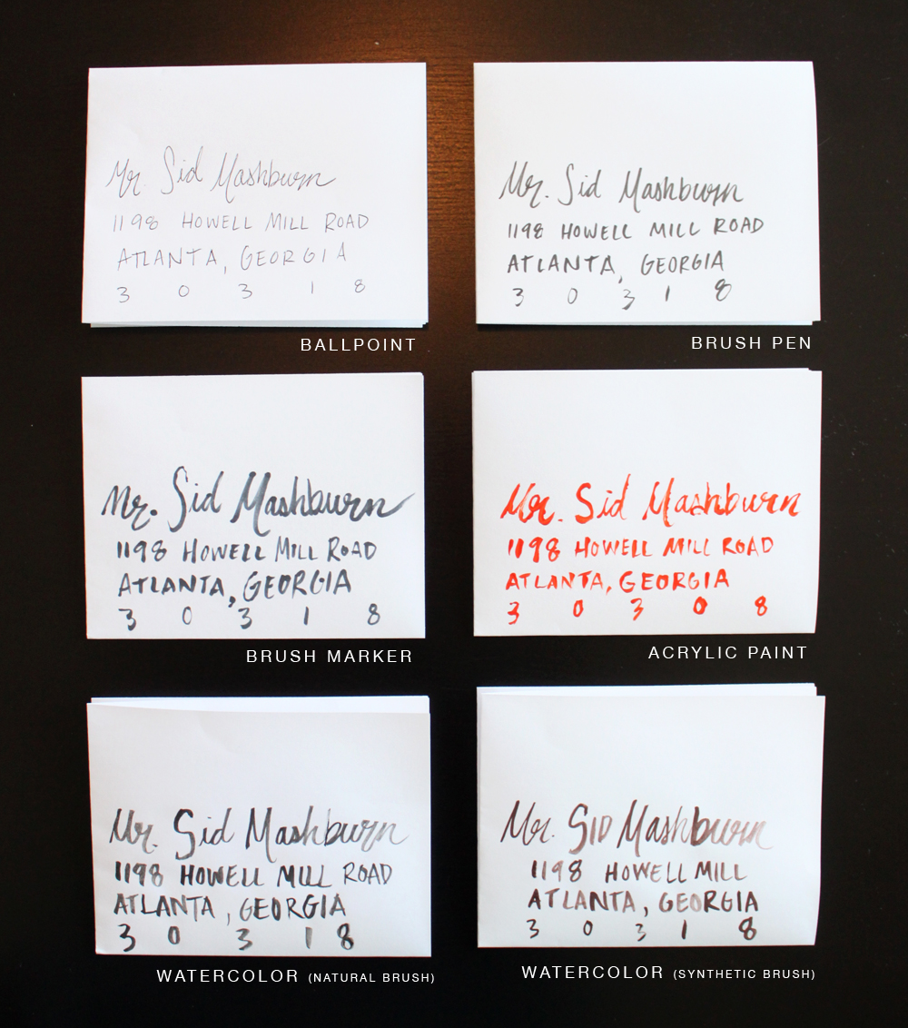
Ballpoint Pen
- Control group.
- Very meh.
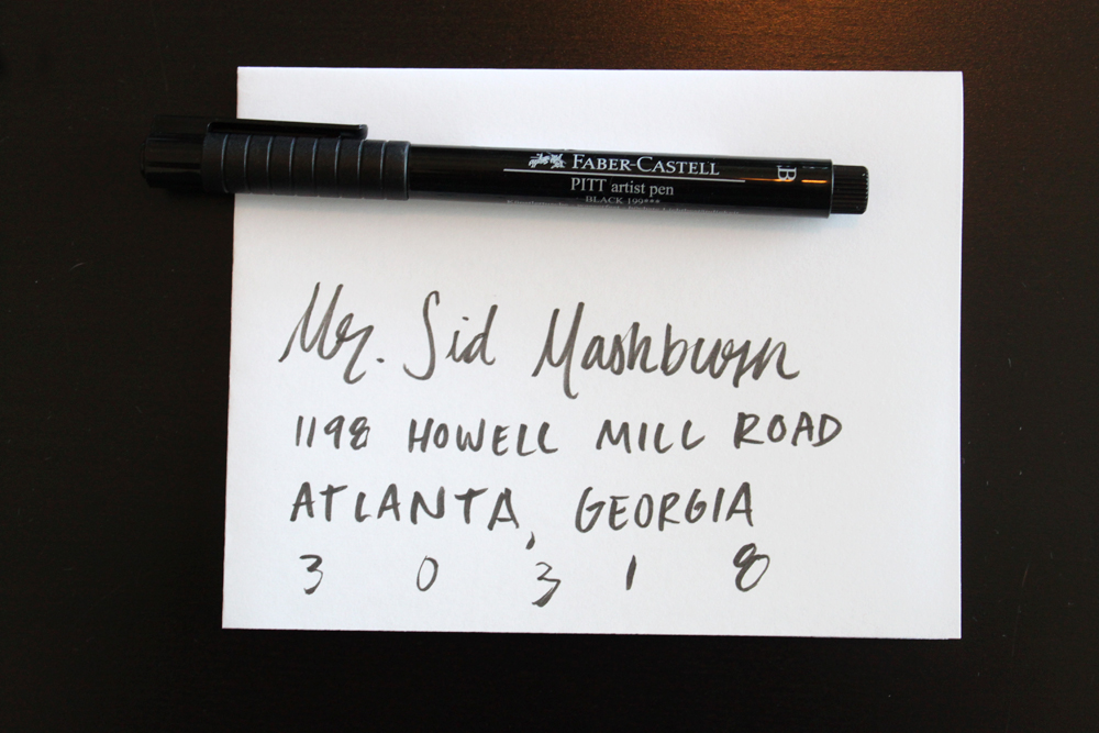
Brush Pen
- An instant improvement over ballpoint pen, but not a lot of character.
- Really easy to use and foolproof.
- If you’re going to address invites with a plain pen, a brush pen gives you a better look with no effort.
Brush Marker
- Way more character than the brush pen. Almost looks like actual paint.
- Difficult to control at times, and inconsistent in its application.
- With practice on consistency, this could be a great result with lots of eccentricities.
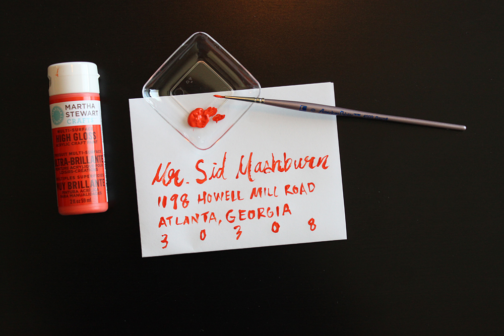
Acrylic Paint
- Really difficult to use.
- Messy result.
- Just don’t.
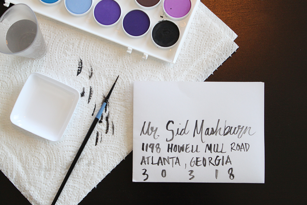
Watercolor (with a natural bristle watercolor brush)
- Lots of character. I love the variety in the ink; it’s translucent in places and very unique.
- Easier to control than the brush marker with the same eccentricities.
- Prone to mistakes; the watercolor brush is designed to hold water, so it drips and splatters a lot.
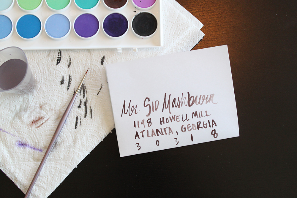
Watercolor (with a synthetic acrylic brush)
- A very similar result to the same paints with the watercolor brush; a lot of the same character and personality.
- On first pass, the synthetic brush is easier to control and manage than the natural brush. I’m able to control the line better. Plus less likely to drip and splatter (though it still happens if you’re not careful).
The synthetic watercolor option was definitely my favorite after trying them all out, but here’s a cheat sheet to see all the results next to each other. I think the ease of use comes through the photo, too. That acrylic paint was a pain, and you can tell.
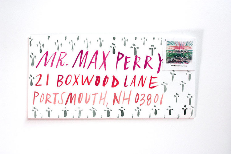
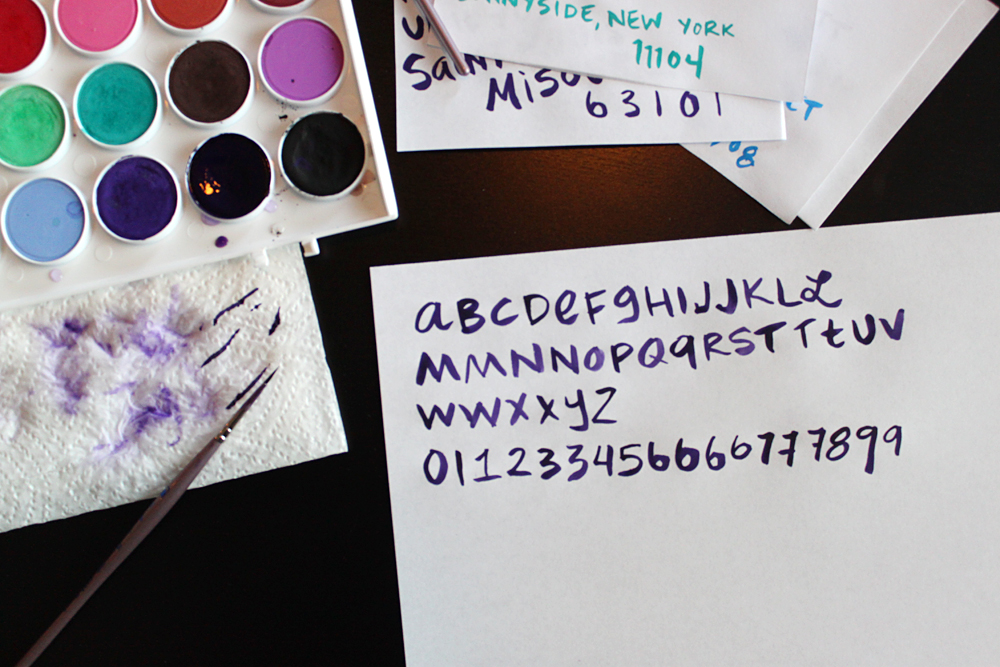
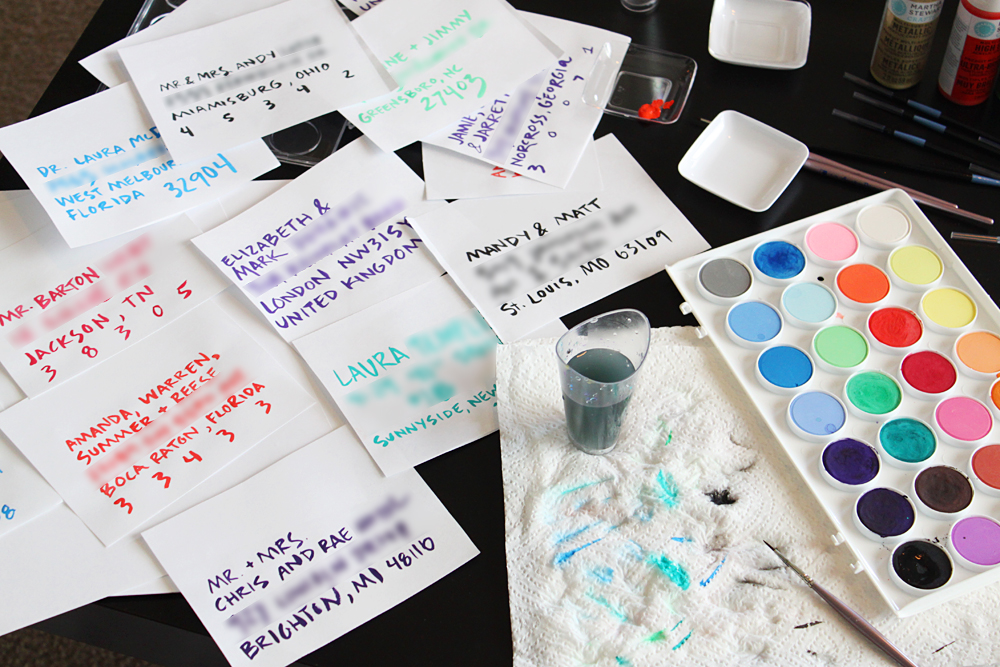
So I liked the last technique, but I wasn’t in love with my first go at it. I decided to practice. And practice. And practice. I developed an alphabet and addressed many fake envelopes with our real guests’ addresses (hence the blurring) to get a feel for how do-able the whole project would be. Would I get sloppy after 20? Only one way to find out. Paint, paint, paint.
I was getting better, but still not loving the result. I decided to practice more, this time on kraft paper, like our envelopes were made out of. I even took some of my best efforts and lined them up next to the Save-the-Date suite I designed to get a feel for how the whole package would look together.
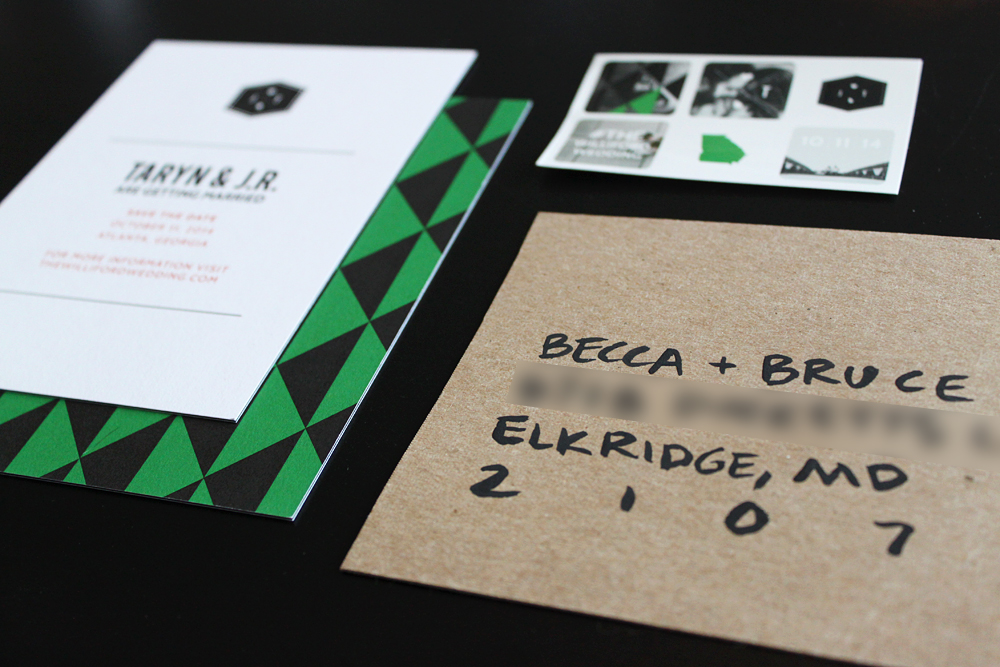
The result was actually very intriguing. I think the water didn’t really soak into the kraft paper like it did the plain paper, so the paint just kind of stayed on top and took on a really cool and unique chalky texture. My goal, however, wasn’t great texture (that would be a bonus). I still wanted the result to look like my original eccentric lettering inspiration.
Did my watercolor lettering capture the feel I wanted? I’m not sure. I think it still looks lazy-messy, instead of whimsical-messy. Maybe I need more practice. Or maybe I need to find another option. Any ideas?