To Seat or Not to Seat: That is the Question
When making certain choices about the timeline or flow of our wedding, I like to imagine myself as a guest. So if you would humor me for a second, let’s try a visualization exercise, everyone:
You’re a guest at the intimate (90-person) wedding of your good friends Rooster and Hen. It’s fun. It’s not formal, but there’s an air of celebration. The ceremony has just ended and the food truck behind the ceremony space has opened. You wait in (hopefully a very short) line, grab your baby back ribs and go find your seat.
What happens next is where I get stuck. Should we let our guests grab their own spots, or assign seats at certain tables?
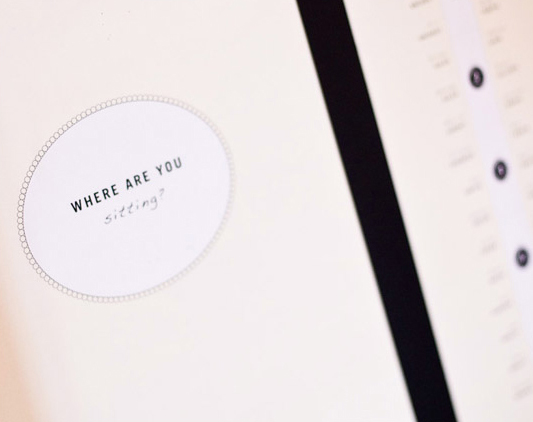
100 Layer Cake, photo by Davina + Daniel
Our initial plan was to not assign seats. The whole day is supposed to feel laid-back, and we don’t want to add any false formality to that whole seating chart charade. I don’t care who our guests want to sit and mingle with. It’s a tight-knit group and a lot of our guests will know a huge chunk of the people there (but there are some guests that will only know two or three others). And hopefully the sitting-and-eating thing happens only for a short time, and after bellies are full, our guests will get up to dance and play games.
But as I browse blogs and boards, I see that the general populous of wedding guests actually prefer assigned seats. The brides on this Weddingbee board suggest assigning seats takes the anxiety out of a situation where some people would otherwise be forced to walk up to a table of strangers. Some of the gals on this board cite that not assigning seats is actually pretty awkward for guests. And the last ones to come in (from out of the food truck line, for instance) often get bad seats or seats with people they don’t know. People are used to some formality in weddings and making them hunt for a seat feels like getting picked last in kickball.
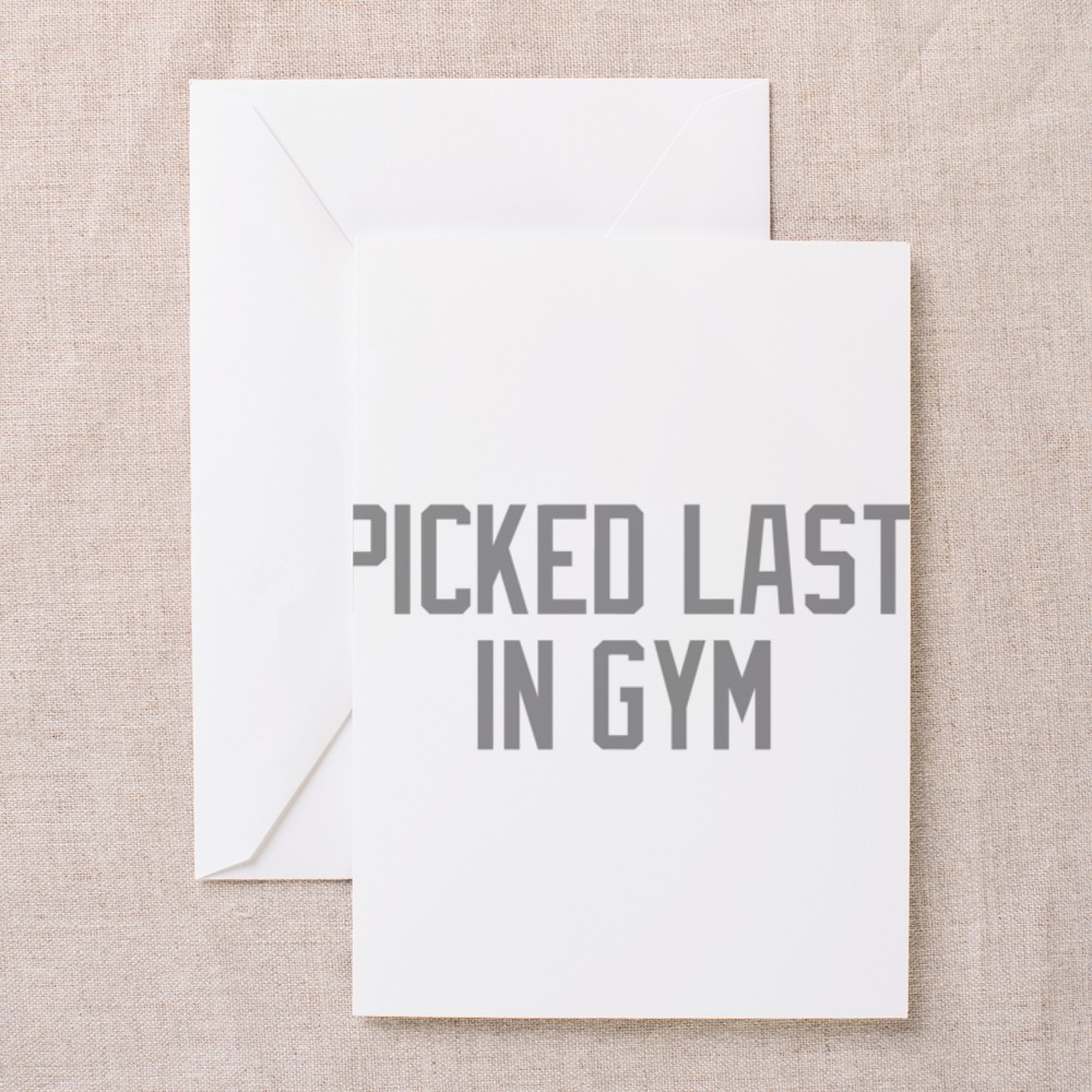
Picked Last in Gym Greeting Card via Cafe Press
Besides the laid-back vs. awkward argument, there’s a couple of other points I could argue for either set up:
Pro-Sit Where You Want
- It adds to the laid-back vibe and hopefully people will mingle all night and not get stuck at tables.
- We have an assortment of chairs and tables in and outside the venue (2-seat tables, 4-seat tables, 8-seat farm tables and picnic tables) and it would be hard to assign people to certain ones and avoid hurting feelings or making people feel like they were separated (to a 2-seater or an outside table) for a certain reason. The smaller 2-seat and 4-seat tables might also help relieve any anxiety from guests who aren’t comfortable sitting with a table of strangers.
- There’s plenty of seats. I think we currently have 96 seats for 90 people in the mismatched table arrangement above. And that number doesn’t even include the lounge area sofas inside or the highboy tables and the ceremony benches outside on the patio (next to the food truck and picnic tables and still right in the action). So any concerns about getting stuck somewhere shouldn’t happen.
- Our food is grab and go. On the off chance that somebody did get stuck not finding an appropriate seat at a table, I think our food truck meal is pretty portable and easy to eat standing up at a highboy table or sitting on a bench. (Think dinner/reception that’s more like a half-seated cocktail hour.)
Pro-Assigned Seats
- Nobody is jockeying for seats or feeling like they can’t spend time with the people they know.
- It gives you a spot to leave your stuff, like a purse or shoes.
I’m obviously having trouble finding a wealth of good points for assigning seats, but I definitely don’t want things to be awkward and for our guests to feel uncomfortable.
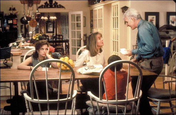
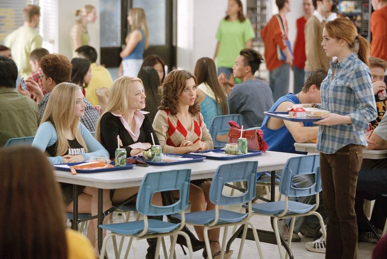 Paramount Pictures/IMDB
Like in the Mean Girls cafeteria scene.
Do you like assigned seats at a wedding? Would it be strange if we assigned seats at our laid-back, mismatched-table fete?
The Guest List: Addresses, Spreadsheets & Thank-You Note Hand Cramps
The number of guests you plan to host at your wedding is one of those surprising things that has a huge impact on the whole bash. Think about it—your head count rules out some venues, determines how intimate your event will be, not to mention how fifty extra mouths impact the food and beverage budget!
Early on in our planning process before we booked anything, Rooster and I sat down with a deck of index cards and wrote down the names of friends and family (and potential +1’s) that we might invite to the wedding. We took our deck and eventually pared it down to exactly 100 people. We weren’t trying to hit a round number, it just happened that way. The whole thing was very Father of the Bride, but with less drama and more wine.
The Blog of Litwits
We found that 100 people was perfect for us. We managed to squeeze both of our (pretty big) families into our deck of cards, plus all of our closest friends (with a lot of out of town guests). But the index cards only worked for so long. We needed to collect addresses for our guests, and even some last names (sorry, friend’s boyfriend I only met once). At the risk of sounding whiny to brides with bigger bashes, I was dreading having to chase down information from every branch of the family tree. Even more, I got tremors thinking about typing it all into a spreadsheet. If there’s one thing I hate, it’s calling people. If there’s two things, it’s calling people and Excel. (Pivot table wizard Mrs. Filly, I am not.)
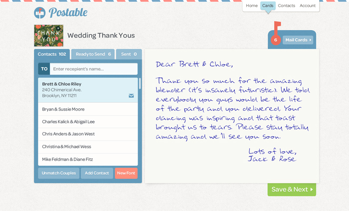
The existence of Postable proves I’m not alone and there must be a lot us out there who hate chasing down addresses. I forgot where I first heard about Postable, but I must have filed it away in my bride brain because they make the whole thing so easy. After you sign up for an account, they’ll set up an online form and give you a link (something like postable.com/roosterandhen) to share the form with your guests. It dumps all of their info into an online address book which you can export to Excel, Email, or straight to an Avery address label template.
 Postable
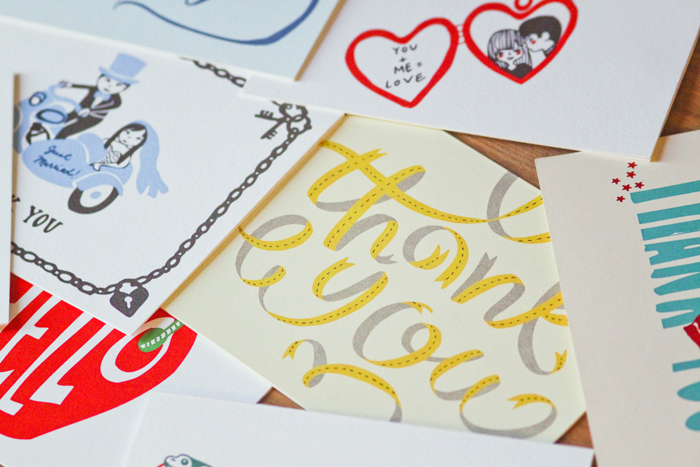
What is potentially the best part about Postable is you can send thank you’s after the wedding straight from the website; they’ll print, stamp and send them on their way for $2.49 each. The part of me that gets hand cramps really likes the idea of typing our thank yous and having the messages printed into real-life (and really cute) cards.
 Barrel
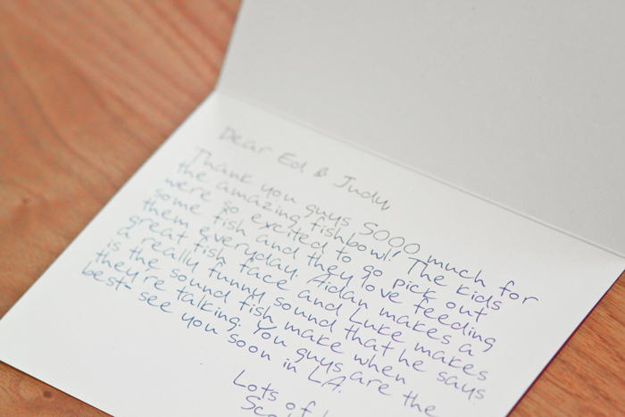
I’m a little concerned that a printed thank you seems less sincere somehow. Even though you can choose fonts that look like handwriting, I don’t think you’re fooling anybody when all your a’s look identical. In fact, it is even more disingenuous if I not only type a card to thank you for coming to the wedding, but then also try to trick you into thinking I hand-wrote it.
 Barrel
Whether or not you do the thank yous, Postable is still an awesome (and otherwise free) tool for gathering addresses and keeping track of your guest list. I exported our guests’ addresses and emails to a spreadsheet, and use it now to keep track of who has RSVP’d through our website’s online form or booked rooms in our hotel blocks.
I’m glad that our group of 100 is a small enough to be manageable and give each guest a little personal hospitality. With my spreadsheet, I’m tracking where guests are staying, when they’ll arrive and other vital stats to make sure we welcome them properly and don’t leave anybody out of wedding weekend festivities. Each of these folks are making a (potentially expensive) trek to be with us on our big day, and we just want to make sure they know how much we appreciate it.
Of course, our perfect 100 has creeped up a bit since our index card days (it’s 106 now). And apparently people are doing this thing called “having babies”? What is that about? We’ve unexpectedly added four babes to our guest list since the first count. Thankfully, the little cuties won’t need their own meals or drink beer. At least not a lot of beer, right?
 Slacktory
I feel at peace with the whole organizing-our-guest-list thing—at least until I have to start sending out thank you’s. Would you be offended to get a printed thank you card? What if it was an obviously typed font and not pretending to be handwriting?
Online RSVPs: Don’t Make Me Hunt You Down
One of the things I was the most excited about for our wedding was creating the wedding website. I know it’s totally nerdy but since I live and work online, I love this stuff. In fact, when a friend asked me recently to design a flyer for our 10-year high school reunion, I went for the extra credit and built a whole website. It seemed easier at the time than cramming all the info onto a 4″x6″ piece of paper.
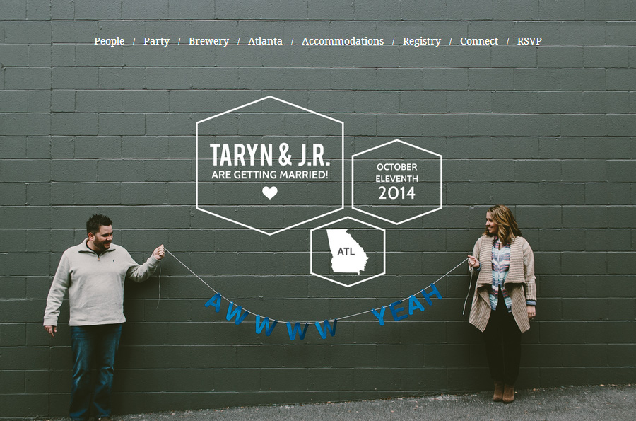 Our wedding website, photo by Paige Jones.
I definitely went for the extra credit on our wedding website, too. I outfitted our wedsite with all the bells and whistles, including an online RSVP form, since the idea of not knowing our final head count until, like, a month before the wedding freaks me the hell out. (There’s so much to do! How do you know how many everythings you need?)
So I thought I’d give an introduction to our online RSVP form and report on how our guests are responding to it.
I created our wedding website (almost) from scratch with WordPress. The RSVP form is powered by Quform, a premium WordPress plugin for building online forms. A license to install the Quform plugin on our wedding website was $29, which I thought was a good price for the added convenience. There are a lot of free form plugins out there, but they all fell short for me somehow. Either they were ugly and not-customizable, or they didn’t have the options we needed in a form.
Quform, thankfully, is super user-friendly and I was able to build exactly the form we wanted, splashy animations included. The form responds to our guests replies as they fill it out, making sure we get all the info we need and nothing more (the name fields expand or contract based on the number of attendees you select). We also asked our guests to RSVP for our pre-wedding-day Meet & Greet on the form. I’m assuming everyone coming to the wedding is coming to hang out the night before, but we’re asking just in case.
Kanye was nice enough to help us out with a demo of the form below. (We’re so glad he, Kim and North can take time from their busy schedule for our wedding!)

So what’s been the reception so far? In the four weeks since we sent out save-the-dates with our wedding website address on them, 16 of our 106 invitees (15%) have been accounted for online (all ‘yes’es, by the way). It’s not as high a number as we’d hoped.
We didn’t explicitly ask guests to RSVP online on our save-the-date cards; we merely included the URL of the wedding website “for more information.” So perhaps some guests haven’t even thought to visit the site yet. Also, on the online RSVP form, we promised that we’ll also be doing the traditional paper reply card thing, so some of our guests might be waiting on that for one reason or another. And I’m sure there’s a massive chunk of people who just don’t know yet. It’s still early; I get it.
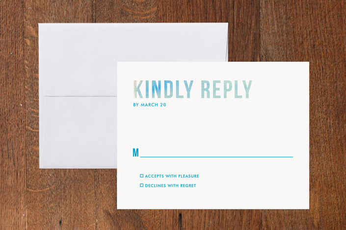 Ombre RSVP card from Minted
When we decided to do the online RSVP form, we didn’t know if we would send everyone a paper reply card (and the coordinating pre-stamped reply envelope) or just the people that didn’t RSVP online. I was leaning towards including reply cards with invitations to only to the people who didn’t RSVP online, mainly because we could save money on postage if a good chunk of our guests took advantage of the online route. But since so few of our guests gave us digital replies, it’s not such a huge money suck.
Still, I think it would be confusing to have replied online and then get a paper reply card with your invite. So I think we’ll take this two-pronged approach:
- For guests that haven’t yet completed the RSVP form on our wedding website, we’ll send them the usual invitation suite with the paper reply card and stamped reply envelope.
- For the guests that did reply online, I’ll replace the reply card and envelope with another enclosure that basically says this: “We got your reply! Thanks! If you need to give us an update, visit thewillifordwedding.com/rsvp and just fill out the form again.”
What do you think? As a guest, would you rather RSVP online or on paper?
Getting Our Wedding Style On Paper
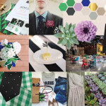
After our color palette was decided, I was able to expand our wedding vision and create some fun inspiration graphics and boards. If you’re a visual person like me, getting things down on “paper” can really help you get a feel for your wedding style.
Color Palette
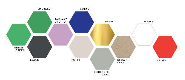
I wanted to create two boards in addition to our wedding palette. The first one I’ll call our “elements,” the items and motifs I want to repeat throughout our wedding.
Elements

Succulent, In Bloom / Ribbon, Blush & Gray / Gold Elephant, Hank & Hunt / Menu, Shannen Natasha via Brides / Dahlia, Malmborgs /Tulip, Floral Muse / Facet Curtain, 3Form
Then, with our palette and elements laid out for me, I opened up Photoshop one afternoon and got to work playing with an inspiration board. I combined what photos I have of our real wedding so far (the save-the-dates, venue and my dress) with pictures I found from real wedding (and not wedding) inspiration around the web.
Inspiration Board
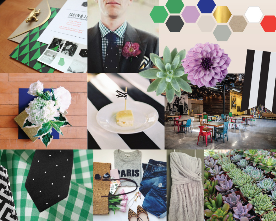
Our Save the Date / Threads by P. Johnson & Drake’s London / Succulent, In Bloom / Dahlia, Malmborgs / Arrangement by Mary Grace Joseph / Bites at Courtney & Chris’s Wedding / Monday Night Brewing‘s Tasting Room / What our men might wear / Sara Mueller‘s Essentials / A terrible photo of my dress / Succulents from San Pedro Cactus
None of this is set in stone, obviously. But now I have visuals to go back to as I’m planning two super-important pieces that come next: what the bridesmaids will wear and what we want on all the tables. As a visual person, this is a huge step, y’all. I just couldn’t possibly imagine our wedding’s look before getting things down, and now I can almost touch it!
Our Wedding’s Color Story
As a designer, I like to think I have a pretty good eye for color and composition. But as a self-professed perfectionist, I have serious trouble making big decisions. I need to know that everything is going to work perfectly together (and perfectly with our brewery venue and fall season) before nailing down so much as a single shade of our wedding colors.
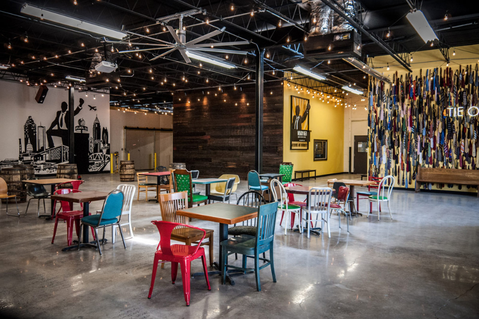
So Rooster and I remained blissfully in the dark about wedding style for the first several months of our engagement until eventually, our save-the-dates would force me to decide. We were nearing the 8-month mark and I knew we’d want to get information about our wedding weekend to our out-of-town guests as soon as possible. I also knew I wanted the save-the-date to coordinate with our wedding style as a whole. So it was kind of important that we knew what that wedding style would be, right?
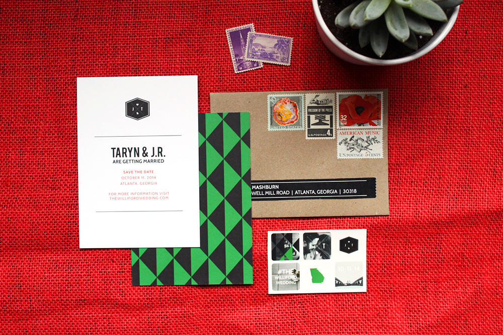
Well, sorta. I ended up totally designing our save-the-date cards before deciding anything at all about flowers or bridesmaid dresses or the color of tablecloths. For the cards, I just went with what seemed right for our venue and season. After our save-the-dates were done, I was able to zoom out and conceptualize our whole wedding theme. So in a way, our save-the-dates are inspiring our wedding style instead of the other way around.
So with our save-the-date in one hand and a photo of our venue in another, I laid down a robust color palette to guide our wedding decisions for decor, florals and attire. We might use all of these colors, or maybe none of them. But I love how they feel together and they’ll help guide us to make choices in some of the important wedding decisions coming up quickly.

Our “Wedding Colors”
I don’t exactly love the concept of wedding colors. I mean, I love seeing themed weddings and adore how everything comes together when you have a color vision for a party. But I think brides (myself included) get so wrapped up in “wedding colors” that they feel like ev.ery.thing. needs to be one of those two or three hues. I don’t want to get trapped by these dominant colors, but here are the shades we’ve chosen to guide our wedding’s color story:
- Emerald Green & Bright Green: Green is the dominant color in our paper, and will probably be a dominant color in the rest of the wedding, too. It’s already repeated in some of the chairs at the brewery and the greenery around the brewery patio, plus I’m sure it will show up again in the greens in our florals. I’m using these two (really similar) shades here to represent a single “hue,” knowing that we’ll likely have different shades of green represented in our bash.
- Radiant Orchid: It’s Pantone’s color of 2014 and dammit it’s trendy. SUE ME. I also love how easy this will be to work into our florals. I mean, it’s named after a flower.
- Cobalt: This shade of blue is one of my favorite colors ever, and I love the way it looks with white, black and gold.
Our Neutrals:
To get a cohesive look with anything from rooms to outfits to events, it helps to balance all the brights with a set palette of coordinating neutrals.
- Black and White: The guys will be in black suits with white shirts. I love black and white stripes and expect to use that pattern on the tables for sure. We’ll definitely use a fair share of this bold color combo wherever we can.
- Brown Kraft: We used brown kraft paper envelopes to send our save-the-dates, and the brown paper texture will surely make another appearance in our invites and in the paper on the day of the wedding.
- Gold: Introducing a metallic neutral is fun way to liven up a palette, and this warm shade of gold is ours. I’m loving gold accents, and loving how they look with our main wedding colors.
- Putty & Concrete Gray: Roo and I have the same favorite color, and it’s gray. Of course we’re going to add this in where we can. Putty gray is actually really close to the color of my dress, and I’ll work in a cooler concrete gray (maybe even some actual concrete) in some of the decor on the tables.
A Pop of Color:
This is my favorite bit of advice for architecting a color palette for events or anything else: Choose one color that’s very different from your palette, and use it very sparingly in tiny, tiny doses.
- Coral: All our colors are cool and a little earthy, so I wanted a pop of something warm and bright. There’s lots of bright red details at the brewery that will pop against our palette, so I plan to use reddish-coral with a light hand around our event (like that bit of the text on our save-the-date that’s coral—I’m not kidding about the super small doses thing).
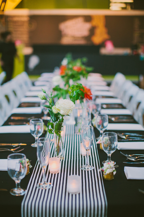
Jackie Wonders via Ruffled
See? A teeny hint of coral to make the green and black pop.
I know I think about this stuff way more than I need to, but I’m really pleased with the palette. And while we haven’t made many style decisions yet, I think it will be really easy to do with this color map in mind.
 Hi! I'm Taryn, a writer, designer and soon-to-be-bride from Atlanta, Georgia. Sit a spell with me and catch up as I plan the wedding of my beer-loving, confetti-throwing dreams to the wonderful Mr. Williford.